Which State’s Nonprofit Association Has the Best Site?
Posted by Zach Hochstadt on August 11th, 2011
Posted in Blog, Nonprofit Design, Nonprofit Web Tags: colorado nonprofit association, design, navigation, nonprofit association, Nonprofit Web, state site, usability, web, web design
As part of our work to redesign the website of the Colorado Nonprofit Association, we surveyed the websites of every other state nonprofit association across the country.
Want to know where the best association websites are? You might be surprised to see that the most populous states aren’t necessarily those who lead the field in our unsanctioned, unofficial review.
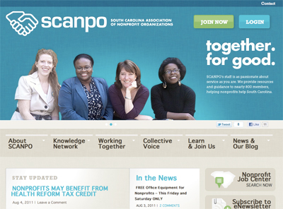
- South Carolina
Hands down, the South Carolina Association of Nonprofit Organizations leads the field. Copy makes the organization’s mission crystal clear. Navigation is simple, photography humanizes the site, and key content areas jump from the page to lead the user to the most important areas. - Oregon
The Nonprofit Association of Oregon benefits from having a good eye for design. A great logo leads to a strong “highlight” space. News headlines and upcoming events are easy to find, and navigation invites user involvement. - Montana
Call me biased (I grew up in Montana.), but Montana Nonprofit Association has a great site. Despite a lackluster logo, the site clearly articulates who they are, makes news and events easy to find, and has a clear grid holding the design together. - Utah
Utah Nonprofits Association employs a dual navigation system, creating an iconic system that leads users to join, find jobs, attend trainings and events, or find an expert. The site employs a strong grid that makes it easy to read. We’d like to see more attention on the member spotlight, though. It gets lost at the bottom. - Connecticut
Like South Carolina, the Connecticut Association of Nonprofits’ site does a great job of quickly summing up its mission: “We help nonprofits help CT.” The site has a clear grid, and it’s easy to find news and events. Drawbacks: How many typefaces can a site employ? While it’s good from a usability standpoint, the site would benefit from a more nuanced eye toward color, type and overall design aesthetic. - California
The Golden State’s nonprofit association sends the message that the organization is big and busy – maybe too busy. It’s tough to know where to look first and it isn’t necessarily clear what actions the Association wants the user to take. - Minnesota
Minnesota Council of Nonprofits lets the user know that there are many ways to get involved. Content areas are clearly set apart from one another, but so many colors! The primary reds clash with the brick red back ground. A clear graphic identity standards manual is needed. - Michigan
The design of Michigan’s site isn’t particularly sophisticated, but it’s clean and approachable. By being sparing in its use of color, Michigan Nonprofit Association succeeds in helping its ads and upcoming events jump to the fore. Adding columns to separate content in the main content area could help bump Michigan higher up this list.
Who didn’t make the cut? See the complete list of State Nonprofit Associations.
Think your state should have made the cut? Don’t agree with us? Add your comments below…
Zach Hochstadt is a Mission Minded Founding Partner and runs Mission Minded’s Denver office, leading the company’s creative teams in the areas of message development, writing, graphic design, and web design and development.
See all posts by Zach Hochstadt