The Insight
A new website wasn’t just an opportunity to signal their new brand strategy or improve the school’s admissions funnel; it was also a key storytelling tool for the brand. Research showed that if Carolina Friends were to refine its site content and tell a more visual story it could distinguish itself as unique among its peers and could better convert interest into action.

The Journey
Being bold comes with risks. Striking design and engaging content might attract attention, but could it also open the school up to criticism? Was the school ready to step into such a bright, purposeful, and distinct identity?
The school worked with Mission Minded to move through a thoughtful and detailed process that considered website analytics, user feedback, architecture and wireframing, and multiple rounds of design.
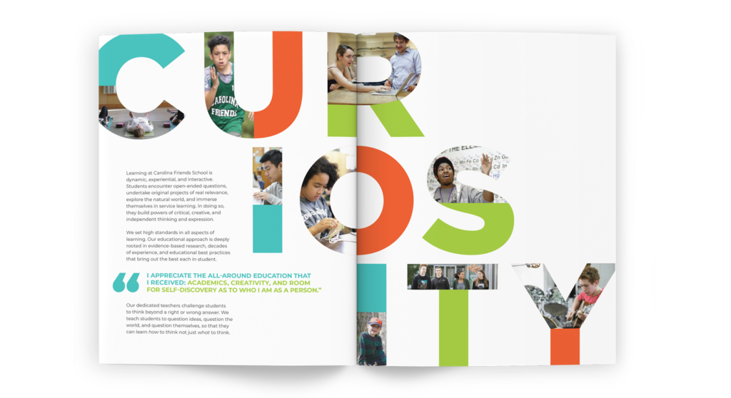
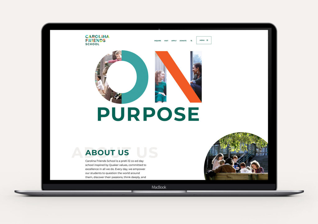
With risks come rewards. The new site uses unexpected shapes and interactions to reflect how the school encourages curiosity. A spectrum of colors visually represents the voices of many different students coming together.

The Impact
With the new site, Carolina Friends School intentionally signals an open invitation for all students to live and learn with purpose and change the world.

We continue to appreciate the work Mission Minded did with us and on our behalf and continue to feel the positive, forward momentum your work has generated (despite COVID).
Nancy Hayes, as Director of Enrollment
