

The Insight
Face to Face occupies a unique and powerful position within the community. They provide deeply personalized, one-on-one support to clients, which sets them apart from more impersonal, institutional service providers. They forge genuine partnerships with individuals, empowering them to create meaningful change in their lives. This partnership approach is not just a service model—it is the core of their identity and the essence of their name, “Face to Face.”
By reclaiming and emphasizing personal connection, Face to Face had a way to differentiate itself in a crowded field and amplify its impact. The organization also realized a need to shift away from presenting data to toward highlighting what those numbers mean for the physical and psychological health of the real people, and their community. We saw that the name “Face to Face” is not just a label but could become a reflection of the human connection at the heart of the organization’s origin and story..
The Journey
To appeal to their most important audiences, a diverse range—from frontline staff to community partners and champions to clients—a brand strategy was developed that prioritized their values. Because it’s those values that lead them to the deeply personalized, one-on-one response to clients’ needs, making this their authentic differentiator. This sets them apart from those who provide services in a more institutional way: Face to Face doesn’t “provide”, they partner.
The Impact
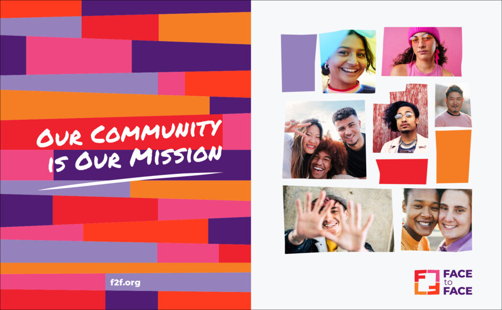
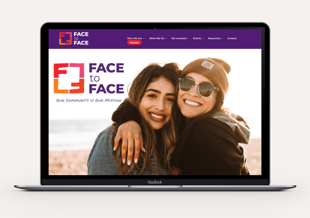
We transformed their visual identity from an outdated logo and photography (that often depicted people turned away—off brand for an organization called Face to Face) to a new and vivid design fitting their new strategy, and helped them relaunch with a new website that brings the mission to life. The new identity features vibrant colors and human-centered photography, reflecting their supportive, fierce, and resilient personality. Partners in their community welcomed the new look and expression of Face to Face at the brand-launch event, and they are now positioned to reach their mission in deeper ways than ever before.
The Board had wonderful feedback about the work and the new communication suite, and were so very complimentary of you and your team’s work. Thank you so much for getting us here!
Sara Brewer, Executive Director