

Banners, signs, and murals can all help your stakeholders have an experience of your brand that brings them emotionally closer to your mission.
At Mission Minded, we call this the brand experience, and you’d be wise to consider what the right experience is for your organization’s brand. First know who your audience is, then you’ll know how your brand should make them feel to tap into the values you share.
Creating great signage can be one of the most cost-effective ways to show visitors what your organization stands for, inviting new supporters and cementing the loyalty of your existing community.
In a recent conversation with Mission Minded Creative Director, Rod Lemaire, I asked him to share examples of how successful nonprofits, museums and schools have used environmental graphics to stoke emotion and connection with their target audiences. The term environmental graphics simply means the visual designs you place in the environment your stakeholders experience.
How can your signage–on campus, in your office, and on the street–reinforce your brand story in a way that enlivens the hearts you seek to engage?
Making people feel something seems like a tall order for a banner. How does this actually work?
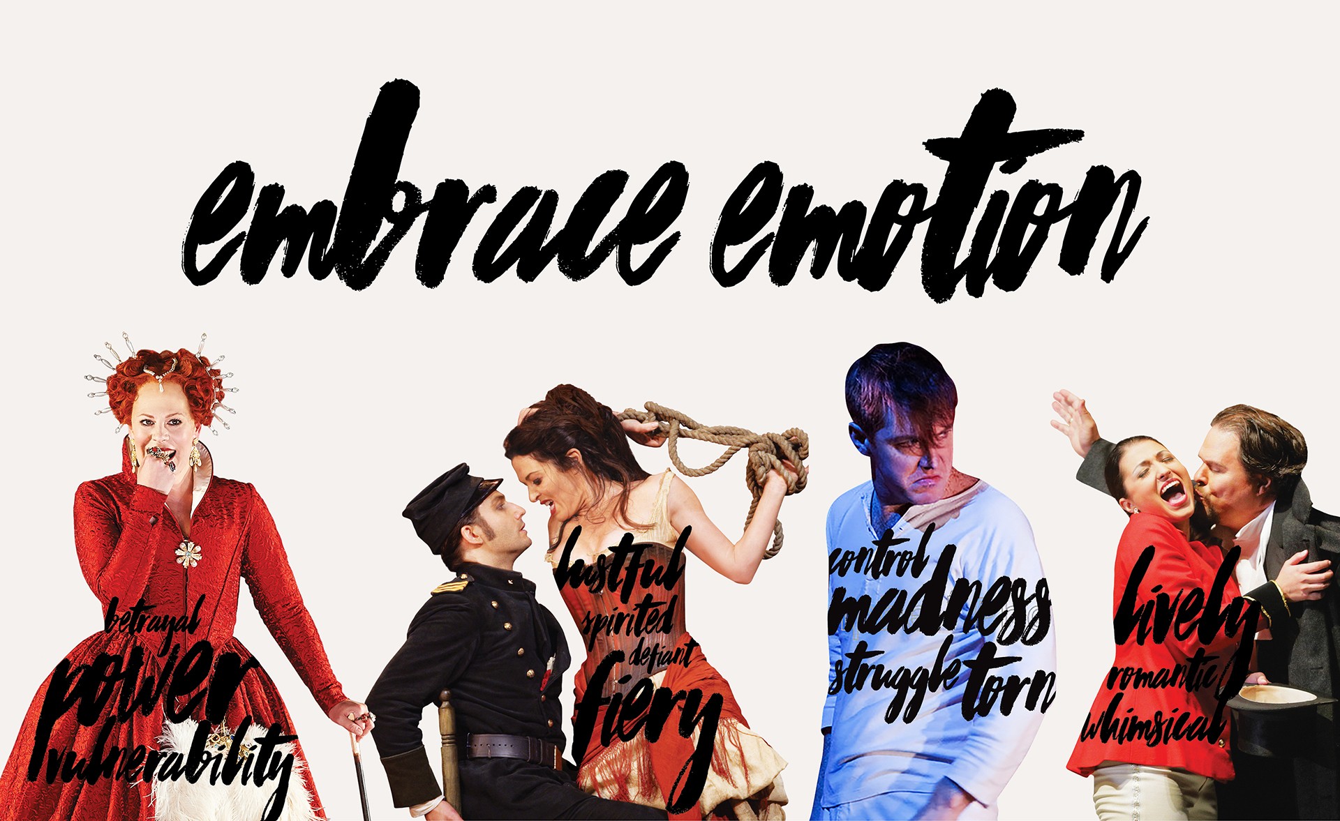
In our collaboration with San Francisco Opera our focus was 100% on helping would-be ticket buyers have the visceral experience of being at the opera performance. But branding doesn’t allow you to put a 4-hour opera into a marketing brochure. The brand centers around emotion and the experience of being in the audience of a San Francisco Opera performance delivers something extraordinarily emotional. But how can that experience be translated? One thing we created were banners on the street that get people electrified enough to walk in the doors.
As part of each season’s campaign we created street pole banners that hung around the city to do just that. In each of the 11 seasons we were privileged to serve this world-class opera company we invented a new theme designed to elicit a feeling—passion, joy, or exuberance.
In one of my favorite campaigns we painted the bodies of the opera singers with words like ‘power’ and ‘betrayal,’ giving the viewer that exciting feeling of watching a soprano deliver a stirring aria, or a tenor woo, the object of his affection. Emotion leads to action, in this case, wishing to experience the opera and so purchasing season or single tickets.
How else can signage help nonprofits connect with their audience?
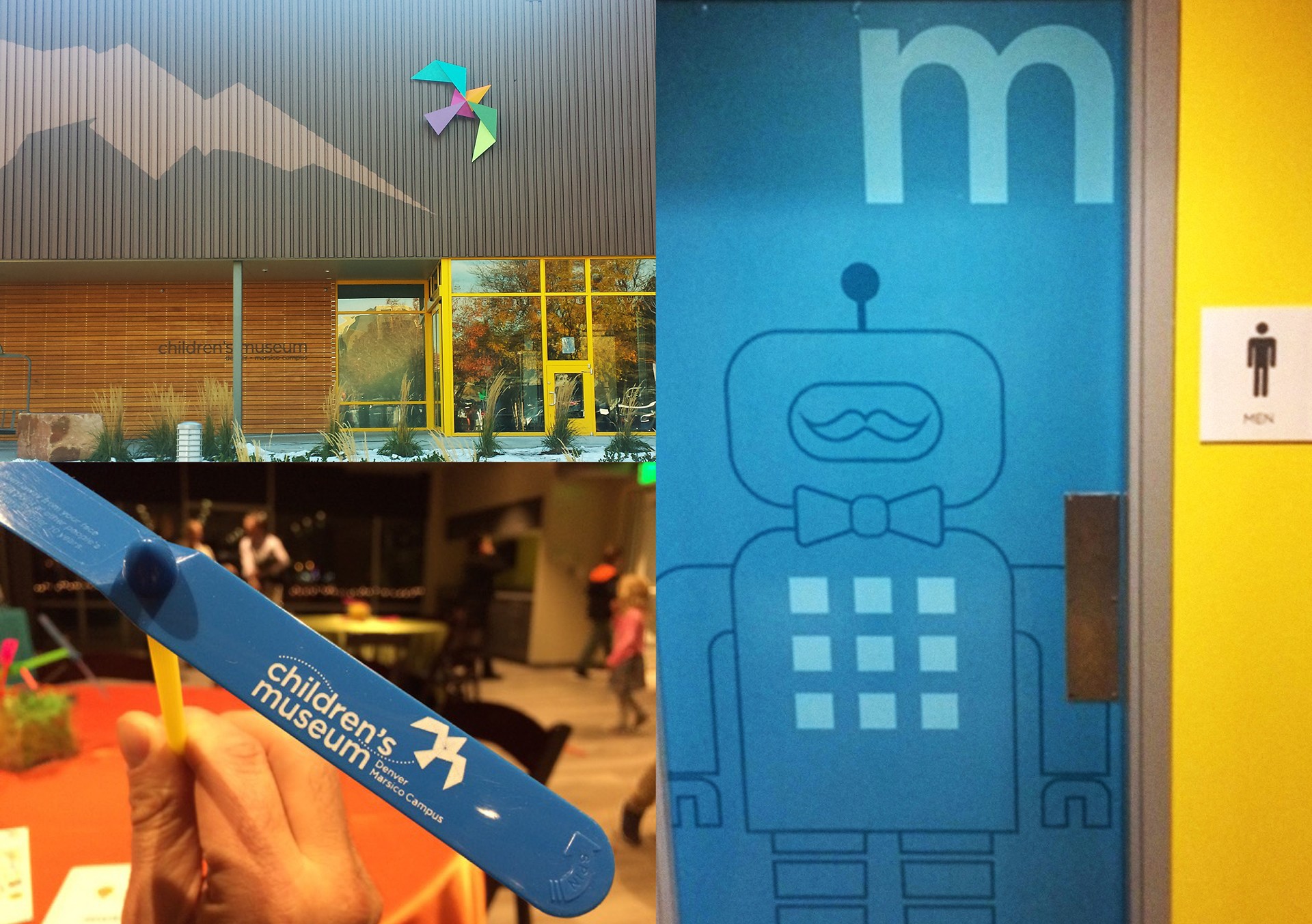
For our client Denver Children’s Museum their brand is all about wonder. So the signage we helped them create starts with the idea of exploration, and engaging the curious young minds who visit.
We were aiming to transcend the content of the actual exhibitions, which of course also deliver on this brand promise, so that even the environment feels wondrous. From the banners on the street that invite people in, to the signage that leads visitors around the museum, everything reinforces that sense of wonder. When you arrive there’s a special kid-sized door for children to experience, while the adults have their own (taller) door. Inside, the building visitors are led around by fun wayfinding signs that stoke curiosity, giving children, parents, and donors an experience of childhood wonderment.
For someone just getting to know you, your signage and how it’s used can send powerful signals about what you value. That shorty door for kids at the entrance signals everything you need to know about the delight this Denver Children’s Museum takes in giving kids their due respect.
Okay, opera and a kid’s museum make it sound easy. What about organizations dealing with more serious issues?
Our client OLE Health in Napa believes today’s healthcare options aren’t giving people what they need. So they do things differently. Their brand is about cultivating the vibrancy to live life well. When we completed their rebrand, which included a new logo and visual identity, they asked us to help bring the brand to life inside their clinics. Wisely, they wanted every visitor to instantly feel OLE Health’s commitment to the vitality of their patients, even before their first appointment. Delivering on your mission is only part of the success for today’s nonprofits. Helping your stakeholders feel what you do is also key.
We used the colors and shapes from their visual identity to signal the wellness and optimism of healthy living. They practice a new model of high-quality healthcare that helps people get and stay healthy, and the on-brand environmental graphics help reinforce that promise.

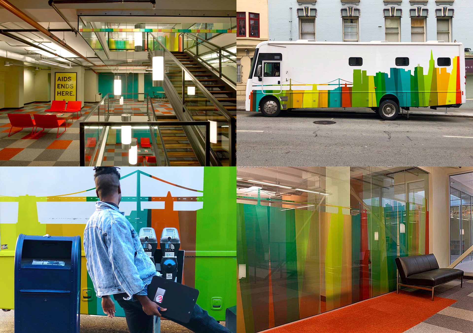
We also helped San Francisco AIDS Foundation shift their brand from one focused on the crisis response to the HIV/AIDS epidemic to one of hope and optimism for a future world without AIDS. Evolving from a visual identity that was stark and alarming with its use of yellow, black, and white, we introduced a new San Francisco AIDS Foundation, an organization that confidently embraced a hopeful spectrum. Vibrant colors embraced and reinvented the rainbow of LGBT pride and was the motif used throughout their new building, signage and street pole banners to bring the community together to realize their vision.
Can environmental graphics demonstrate your values?
Absolutely! That short door at Denver Children’s Museum demonstrates their respect for children’s unique perspective. It’s a clever signal. OLE Health’s office and clinics use the bright and optimistic colors showing they value helping visitors feel good. But being really literal also works.
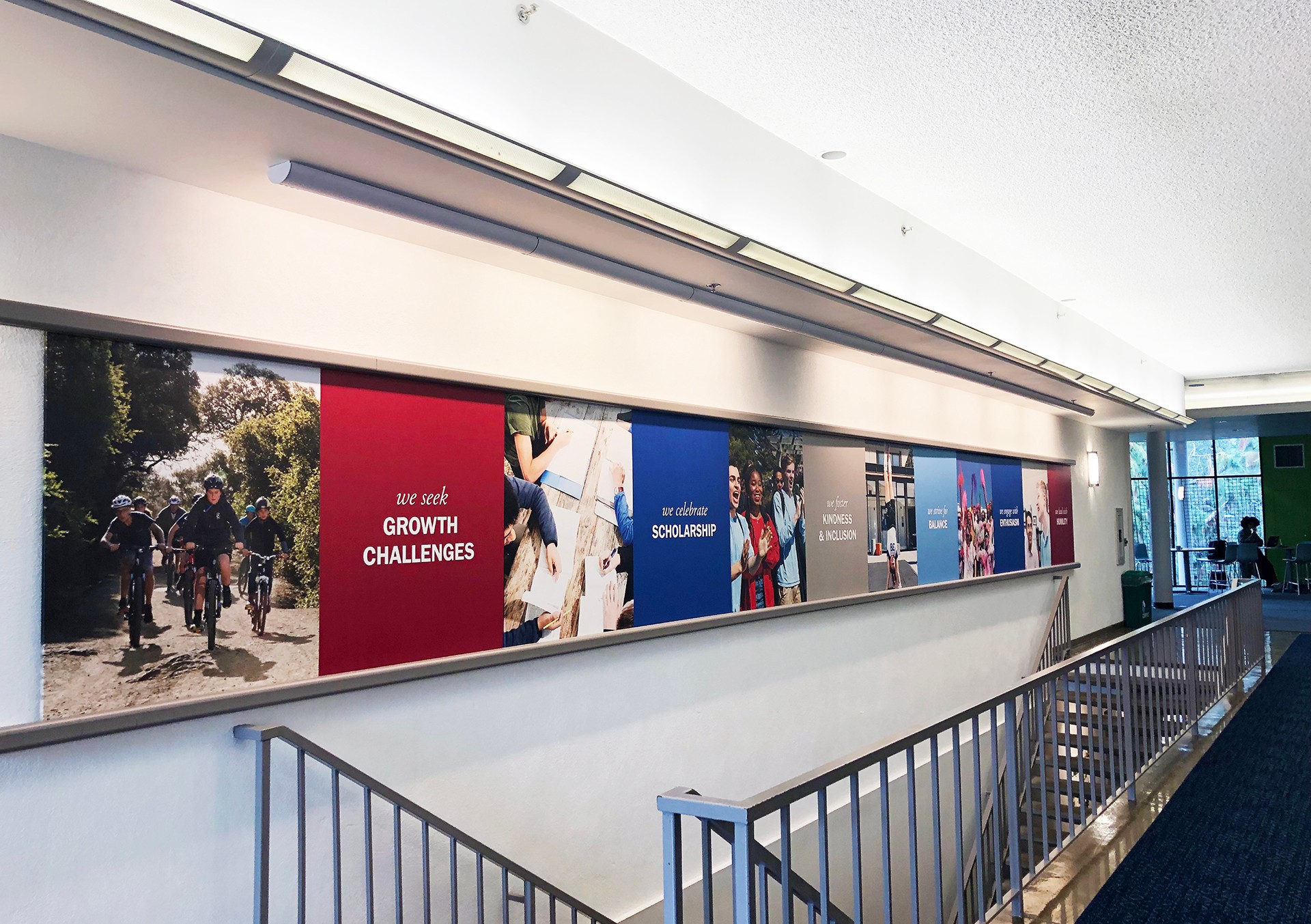
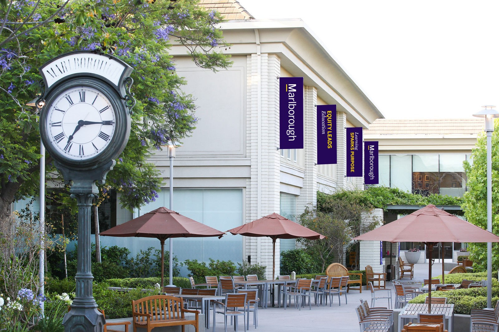
Marlborough, in Los Angeles is a 7th-12th grade school for girls. They embrace differences, seek commonalities, and prioritize kindness to positively impact each other and their community. Their mission is to ensure young people use their voice and they provide a foundation that leads to the confidence to do so.
They wanted their values boldly promoted with literal depictions of each around campus. Posting them on large canvases elevates the values and ensures everyone in their community stays focused on them. And visitors, such as prospective students, get the message right away: At Marlborough our values are alive and activated every day, not just in the classroom experience, but also in each one of us in this community.
What is the best advice you can give readers who want to maximize the opportunity to connect with people through environmental graphics?
Of course, each example I’ve shared was possible because of a solid brand strategy behind it. Before you can know how your environmental graphics should look, you first have to deeply understand your brand goals.
Who are your target audiences and what are you trying to get them to feel? That brand experience is the goal for anything you create inside your buildings, on your campus, or on the streets leading to the place where your mission comes alive.
Thanks, Rod!
Reach out to us to learn how we can support your next signage project that reinforces your organization’s brand!


