Do Your Logo and Visual Identity Send the Right Signals?
Posted by Rod Lemaire on January 22nd, 2020
Posted in Blog, Nonprofit Branding, Nonprofit Design

Contrary to common misconception, your logo is not your brand. It’s a powerful symbol for your brand.
Think of your brand as your organization’s reputation, one built as the people who encounter it experience how you act, what you do, what you say, and how you look. At heart, brand is the big idea you want people to associate with your organization. And your logo is a front-line, powerful tool you can use to kindle (or re-kindle) those positive associations.
For many, an organization’s logo will be one of their first interactions with you. That’s why your logo has to hit the right notes and convey the right information immediately.
Your Logo is Part of Your Visual Identity
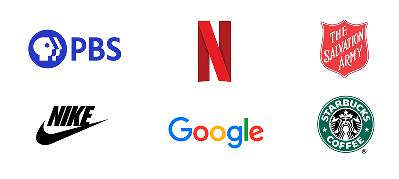
A logo is an abbreviated expression of a brand—and there are all different kinds of logos. Some, like the PBS people or Nike swoosh, are graphic icons. Others take the shape of a letter (as in the Netflix “N”) or present the organization’s name in stylized text (Think Google). And then there are emblems or seals, which combine letters and graphic elements in self-contained symbols, as the Salvation Army or Starbucks Coffee logos do.

There isn’t one kind of logo that’s better than another. It all depends on your organization and who your target audience members are.
If you’ve given any thought to it—which you hopefully have—your logo is part of a deliberately crafted package of visual identity elements. Those elements should include fonts, colors, photography style, and other visual treatments you use to reinforce your brand.
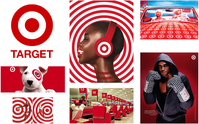
You might, for example, have a palette of colors you use in all your materials so that people recognize your communications as yours. Target uses red and white. They have a typeface they always use, and a visual aesthetic they apply consistently, so even if you just see a second of a Target commercial, you can recognize its provenance and remember the brand.

Taken all together, visual identity elements help communicate what kind of organization you are. They reinforce your personality and create a shorthand through which you can engage your audiences.
You probably already have a logo, and—intentionally or not—a visual identity as well. The question is: is that logo and visual identity sending the right messages?
How We Assess Logo and Visual Identity
To know what kind of logo is right for your organization, first you need to be clear on your brand strategy. What’s the one big idea that underpins all your work and distinguishes you from other organizations?
If your logo and visual identity advances that brand, it’s a success. If it doesn’t, it’s time to invest in a change.
At Mission Minded we help our clients evaluate their visual identity as part of an overall evaluation of their brand. It’s not simply whether it looks good or bad; it’s whether a logo says what you need it to say. Is it engaging your audience effectively, or have you inherited something slapdash, or from a previous incarnation of your organization when priorities were different?
When we assess a visual identity, we ask the following questions from the perspective of both brand strategy and design experts.
- Does the current logo and visual identity communicate the essence of the brand?
- Is the aesthetic appropriate? By this we mean: Does the personality of the logo match that of the organization and suit the field in which you operate?
- Objectively, is the work of good quality? Are the logo’s proportions right? Is it legible? Are the fundamentals of good design employed? Sometimes the idea is there, but the execution just isn’t up to par.
- Is it outdated? Some decades-old logos hold up, but many need a refresh so they don’t feel tired—and make your work look like yesterday’s news.
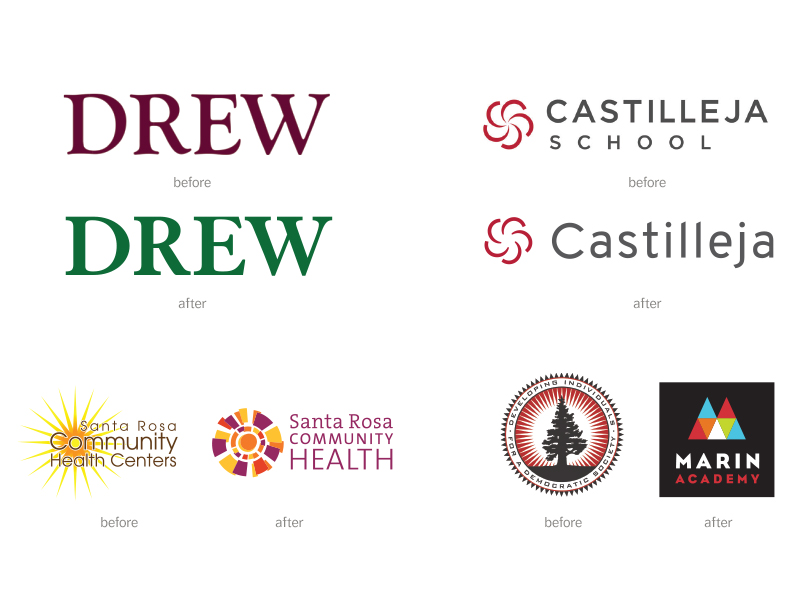
If a logo or visual identity refresh is in order, we’ll consider just how intensive a reworking is needed. Some organizations’ logos are in reasonable shape, only needing some refinement to serve as effective brand tools. Take, for example, Drew. An independent school in San Francisco, Drew used a stylized wordmark of their name as a logo. The general idea was on target, but the colors and the font were out of alignment with their evolving brand. Switching to green and switching to a cleaner font better represented a school known for valuing individuality.
For an example of more dramatic change, consider Santa Rosa Community Health Centers. As that non-profit health service organization grew and changed, its old logo and visual identity no longer communicated its personality and desired reputation. A complete redesign transformed the feelings conveyed and the story told. Look at their old logo and their new one and see if you can, instinctively, read the story the new one encapsulates.

What Can You Do?
While you may lack the brand strategy or design experience to develop a new visual identity for your organization, you likely have the experience and intelligence to assess whether what you’re using currently works. We recommend you ask yourself the following five questions:
- What are the brand personality traits for which your organization wishes to be known? Do you see those embodied in your current logo or visual identity?
- Recall your organization’s mission statement. Do you see that story, or even part of that story, reflected in your current logo or visual identity?
- On a practical level, do you have trouble reducing your logo to a small size for use on business cards or as a social media icon? Do the graphic elements or typography break down when increased or decreased in size dramatically?
- Is your logo cliché? Does it stand out when seen alongside those of peer organizations? Your logo and visual identity should help your organization distinguish itself from others in the same field.
- Does your logo appear designed by committee? You can usually tell if this is the case if there’s no single big idea communicated by the design. It will either be a hodge-podge of competing ideas or lack any coherent message—even if it looks nice.
If this exercise points you in the direction of a new or refreshed visual identity, we’re glad to help. At Mission Minded, our visual design work all springs from brand strategy. We don’t just want your new logo to look stunning, we want it to tell the right story and evoke the right emotions so that your organization’s brand gets broadcast loud and clear every time people see it.
Rod Lemaire is a Mission Minded Partner and Creative Director, overseeing our award-winning design studio. Rod delivers more than a decade of art direction and communication design expertise for mission-driven organizations.
See all posts by Rod Lemaire