In a time (always) where consumers are constantly bombarded with messages and requests, first impressions are everything. That’s why it’s so important for your nonprofit to have a visual identity that supports the core beliefs and impact of your work.
We recently helped our friends at Energy Outreach Colorado develop a new brand strategy, culminating in a redesign of their visual identity. Through our collaborative journey to a refreshed visual presence, we used a few key learnings to root their design in a strategy that supports their brand. Here are three:
Evolve for your audience
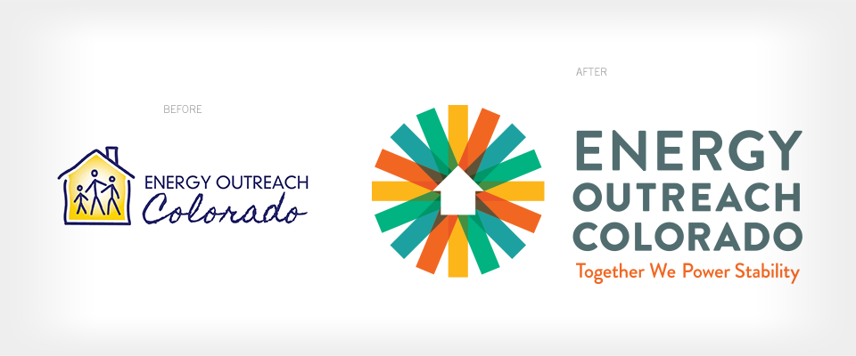
Energy Outreach Colorado has always helped their neighbors stay safe and warm in their homes, so having a house in their logo was natural. But as a champion for home efficiency, working both with the public and with policymakers, they needed a logo with momentum and forward moving energy. An evolution of the existing house to a logo with arrows and sophisticated lines give a sense of movement, energy and impact, allowing Energy Outreach Colorado to step forward as a force for the vital resources that power homes.
Be bold
As a beacon for warmth and security, the yellow used in the original Energy Outreach Colorado visual identity was a leading color for the brand. But as steadfast partners to their community and their peers, Energy Outreach Colorado offers much more than home energy bill payment assistance. Their programs and services are dynamic and widespread, empowering Coloradans to take control of their home energy, instead of just giving them a handout. The new color palette works to reflect the totality of Energy Outreach Colorado’s personality. The yellow is an optimistic and forward-thinking evolution of the previous yellow. The blue feels fresh and soothing, reminiscent of Energy Outreach Colorado’s ability to collaborate with ease, while the orange paints them as dogged, reliable partners. The green adds a nod to the efficient and sustainable nature of the work, while the gray lettering reflects Energy Outreach Colorado’s brand traits of being reliable, trustworthy, and compassionate advocates.
Connect
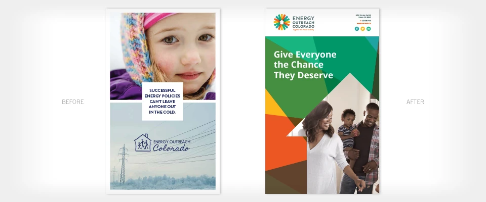
At the heart of Energy Outreach Colorado’s work lies their local neighbors, just like you and me. While their services may help customers through tough times, it’s the positive outcomes and personal stories that empower them to do the work they do. People are the subject matter of photography in the new visual identity, featuring positive, interactive body language. People are interacting together and engaged in their activity, giving readers or viewers a sense of authenticity and community. By using photography to showcase positive moments in our neighbor’s homes, Energy Outreach Colorado can capture the relatable and authentic emotion that families feel when they are able to focus on living, rather than merely surviving.
Looking at your own organization’s brand strategy, can you explain how it maps back to the strategy of your visual identity? Is your design intentional?
Don’t stop there! Your visual identity and brand strategy can play out in all sorts of ways. For example, what about your office space? Read on here about designing an office with brand in mind.