

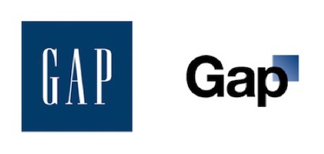
As reported everywhere today, clothing retailer Gap pulled its new logo only one week after launch. The question is: Why did it fail?
First, let’s define terms: a “logo” is an icon that represents a brand. It is a piece of visual language that stands for a larger idea. A “brand” is that idea. A brand is a synonym for for reputation. It is the sum of experiences a person has with your organization, your product, your representatives and your marketing materials.
We have emotional relationships with brands. We associate brands with experiences and ideas , and a good logo directly connects with that association.
[The Gap Logo, Before and After]
When we disconnect an idea from one icon and try to connect it to another, we are essentially asking the public to learn a new word. We are saying, “The word ‘table’ should no longer be used. Instead, please call it a ‘mesablok.'” Sounds weird, right?
Think of it this way: the kitchen table is symbol of family. It’s where we come together, discuss ideas, make decisions, and unite as kin. If someone were to tell us to change the word for “table,” we’d rightly reject them.
The brand of the Gap hasn’t changed: the store is still a place to go for basic, inexpensive, classic style. By rejecting the new logo, consumers were really saying, “Don’t mess with your brand. We like you for what you are.”
The Gap made a mistake. They put a beloved logo out to pasture and replaced it with an inferior icon. And they’ve paid for that mistake.
So When Should You Change Your Logo?
The time to change your logo is when it no longer reflects your brand. Consider Banana Republic, Gap’s sister brand. In the ’80s, the brand was for adventurers and explorers and had the feeling of a safari. Today, the brand is about upscale style and urban sophistication. A new logo made sense because the underlying brand has changed.
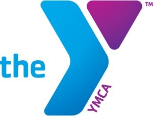
Same with the nonprofit world. Just look at the Y. The organization needed to be seen as relevant, welcoming and community based. The old YMCA logo suggested swimming pools and camps we associated with our childhoods; the new logo reframes the organization as the group that will provide the services we need today and tomorrow.
[The new Y Logo]
Brands and logos are tricky things. If you’re considering a switch, think carefully about why that change is needed. What are you trying to say about yourself that you’re not currently saying? What does your audience care about, and how can you connect with their concerns? Brand equity should not be taken lightly. As the Gap has shown us, your constituents may care more than you think.


