

This fall, Mission Minded helped three of our clients—Yale Center for Emotional Intelligence, Global Glimpse, and NNOHA—launch brand new websites. More than ever before, these organizations’ websites convey who they are with intuitive design and precise copy. Each new site will help them attract new audiences, convey their value, and inspire support.
Below, we’ve explained how each of the three websites improves upon their older counterparts. If your organization wants to revamp its web presence, read on for inspiration.
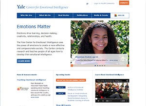
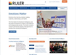
The Yale Center for Emotional Intelligence brings emotional intelligence training programs to people of all ages. Before, the Yale Center team’s web presence was divided between a site for their program, the RULER Approach, and a site for their research laboratory. The Yale Center’s new website was designed to promote their work and vision while establishing a consistent organizational brand.
Yale Center’s new web copy rallies their audiences around the idea that “Emotions Matter.” From there, the audiences can read relevant news or explore the center’s various programs, publications, and initiatives. They can also register for events or donate.
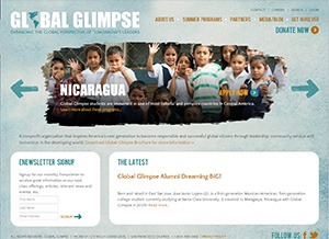
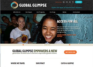
Global Glimpse supports low-income or otherwise underserved kids so they can study abroad. Once the organization adopted a colorful new logo, Mission Minded was hired to redesign its website so that it would more effectively convey Global Glimpse’s personality: youthful, friendly, and globally-minded. The new site also has improved blogging capabilities, so traveling students can more easily share their stories.
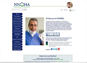
National Network for Oral Health Access—better known as NNOHA—provides resources and support for oral health professionals that work on programs for the underserved. Their old website had a confusing hierarchy of information that made it difficult for users to find resources or learn more about the organization.
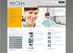
With its eye-catching slider, the new website appears contemporary and sophisticated. It better explains what NNOHA does and how audiences can participate. The site also enables members to find relevant resource materials, and boasts a custom-built job bank.
For more information on effective website redesign, visit our blog archive on nonprofit web.


