We can’t reiterate this enough–injecting emotion into your next capital campaign is essential to its success. Emotion, after all, is a key element in our equation for a great case for support.
Rationale + Urgency + Emotion = Great Case
Once you’ve written a great case statement, your next job is to make sure it isn’t a chore to read.
At Mission Minded, we make sure every fundraising case brochure we design–whether for an annual campaign, capital or endowment campaign–passes the “I’m too busy to read” test.
For us, that means imagining that a prospective donor never actually reads the text.
We picture her flipping through the brochure, looking at the headlines, the call-out copy, and the photos. She’ll absorb the primary message at only the highest level. She’ll get a feeling from what she sees. But what if she never actually reads the words? Will she still be inclined to donate?
I asked Mission Minded Partner and Creative Director Rod Lemaire to highlight some of the best practices our team employs to design a fundraising case that stokes donor engagement. Use these four tips to create a compelling case for support brochure for your next campaign.
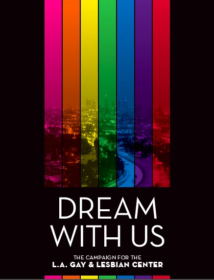
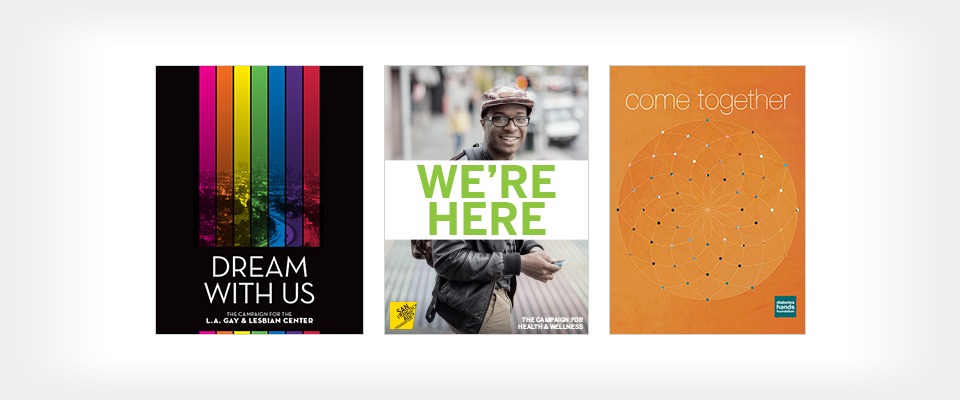
1. Make the Cover Irresistible
The cover of your case should cause a double take. Avoid the urge to simply put your organization’s name or a rendering of your new building on the cover. That won’t create the “WOW” moment you need to draw your donor in.
Instead:
- Keep it simple. A cover should be an easy “get.”
- Make it bold. Use colors and large design elements to make an impact.
- Consider multiple covers. This creates intrigue and interest.
- Include photos of the people who are impacted by your work.
Take a look at some case for support covers created for Mission Minded clients.
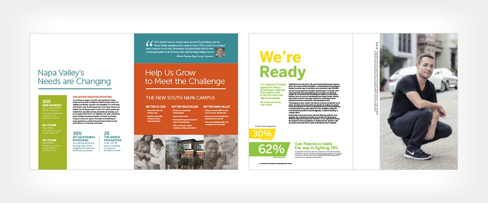
2. Make the Copy Digestible
Eight pages of running copy is a snooze. And, quite frankly, many people are unlikely to read every word written in your case. Instead, use design to present the most important ideas in a clear way.
Approach your content this way:
- First, decide what big ideas you must convey on each page to make your point.
- Next, use headlines, callouts, and sidebar text boxes to cover each of those big ideas.
- Last, fill in the details using running copy in paragraph form. And then edit, edit, edit. Remember, your donor may never take the time to read all of the text, though you hope she will. The shorter it is, the greater the likelihood.
Look how we made the copy digestible for OLE Health and San Francisco AIDS Foundation. Notice how the content is broken up. Even if you didn’t read the paragraphs, you would come away with the big ideas just by reading the bits of information that jump out from the page.
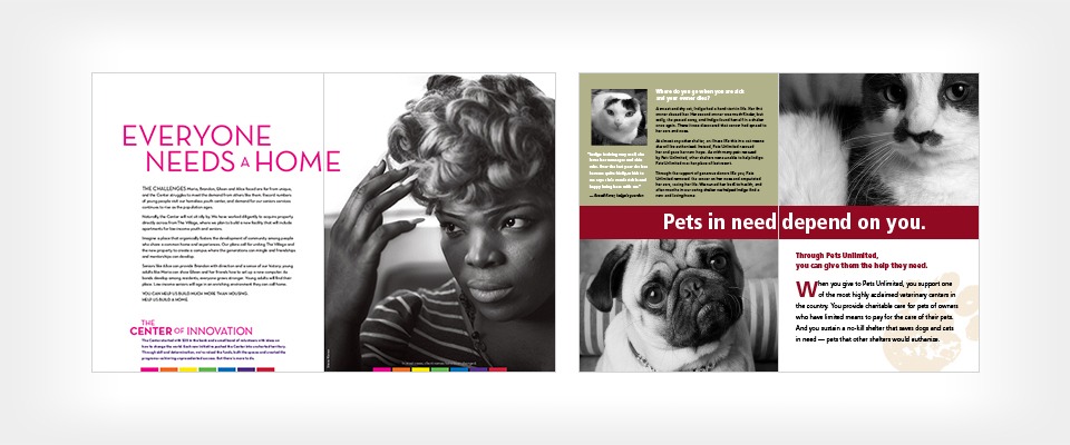
3. Choose Photos That Engage
Thou shalt not use boring photos! That picture of you and your colleagues smiling proudly at this year’s gala may conjure up warm memories for you, but probably won’t for your reader. Photography is a great way to make an emotional connection.
Instead show:
- Photos of the people, animals or places your group helps
- Close-ups and faces
- Dramatic images
- Action shots
Don’t show:
- Posed group photos
- Donors giving checks
- Speakers standing at a podium
- Fancy benefit balls and dinners
Here are examples from Los Angeles LGBT Center and Pets Unlimited. Aren’t these much more compelling than a photo of a building?
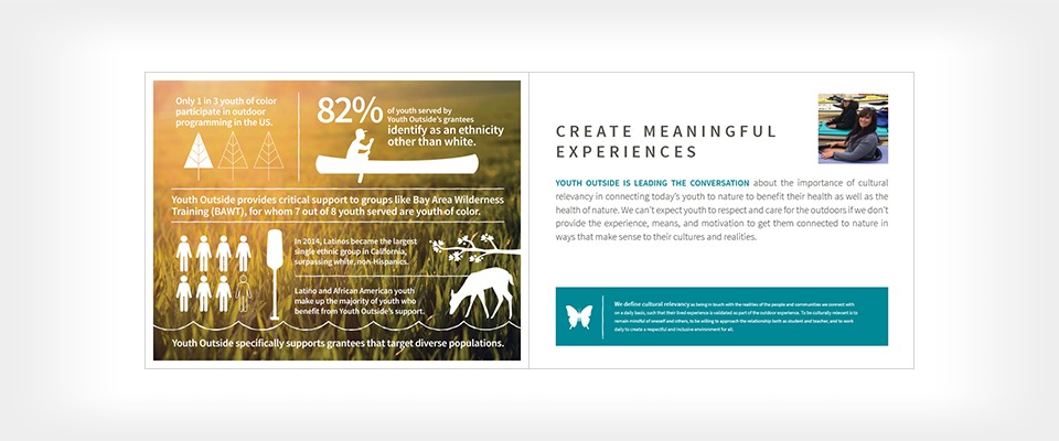
4. Embrace the Infographic
We get it. Some of your donors are the-proof-is-in-the-pudding kind of folks. And you may need to include some statistics and data in your case to connect with them.
Here’s how to do it well:
- Jazz things up. Don’t resort to a boring pie chart or a list of facts and figures. Create eye-catching infographics that grab the reader’s eye, and make meaning of the numbers.
- Consider creating one-page inserts for the back folder. The back pocket is a great place to share more in-depth information with those who are interested (and avoid overwhelming those who aren’t).
- Use infographics and data as a supplement, and never as the only way to convey why someone should support your organization.
Here is an example of how a strong infographic can help and not bog down your fundraising case for support.
Follow these design tips to create an emotional connection with your audience. You’ll get your point across, even for those who are too busy to read the entire fundraising case.
For more tips, download our marketing guide on using design to engage your audience.