The Secret to Great Pole Banners (Case Study: San Francisco Opera)
Posted by Zach Hochstadt on July 30th, 2010
Posted in Blog, Nonprofit Design, Performing Arts Tags: Arts marketing, banners, design, nonprofit, simple, street pole
San Francisco Opera is about to launch its 2010-11 Season, and (Mission Minded-designed) advertisements have already hit the streets. While there are a number of elements to the public marketing campaign, one of the most noticeable — and difficult to create — is the street pole banners.
At Mission Minded, we strongly believe that designing a successful street pole banner is like writing a great haiku:
If you say too much
You have said nothing at all
Brevity is key
Many organizations fall into the “Too Much Information” trap. They want to include sponsor logos, dates, times, phone numbers, and catchy copy. Others fall victim to small type. And still others ask the reader to think about too many things at once.
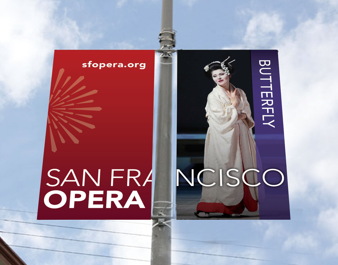
A great pole banner is simple. It introduces an idea and gives readers a single, clear way of responding. Take a look at the San Francisco Opera banner above for Puccini’s Madama Butterfly, above. Imagery and a single word from the title introduce the excitement of seeing one of the world’s best-loved operas. The URL is all that is needed to tell readers how to respond.
Moreover, the banner takes full advantage of the space available, allowing the word “San Francisco” to jump the space taken up by the pole. The result: Even readers driving at 30 miles per hour can still read the name and know what to do.
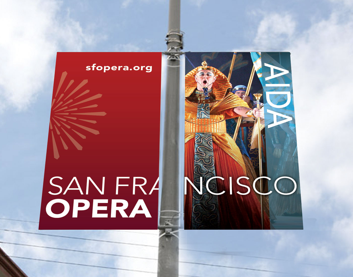
San Francisco Opera Street Pole Banner - Aida
The next time your organization sets out to create street pole banners, remember: Stay simple, clear, and easy to read. Give your audience a single clear step to take, and don’t confuse people with extraneous information.
Zach Hochstadt is a Mission Minded Founding Partner and runs Mission Minded’s Denver office, leading the company’s creative teams in the areas of message development, writing, graphic design, and web design and development.
See all posts by Zach Hochstadt
[…] The Secret to Great Pole Banners (Case Study: San Francisco Opera) | mission-minded.com mission-minded.com/blog/?p=230 – view page – cached How to create a great street pole banner for your arts organization. Tweets about this link […]
This was really interesting. I loved reading it
Love this campaign and the MUSE – UM campaign as well. You’ve done so much with such little space. I look forward to seeing these ads in the city. They don’t seem like ads – they are cultural decorations for our city!
Thanks, Shannon. Appreciate the positive feedback!
This really answered my problem, best wishes!