Portfolio / Boettcher Foundation
After 75 years of Colorado giving, the venerable Boettcher Foundation was at risk of being seen as stodgy. A strategic rebranding sought to shift this perception, placing greater focus on the foundation’s forward-looking investments and in those who, as the brand promise communicates, “Climb above timberline.”
The effects of Boettcher’s new brand seeped into every part of their work, giving them the tools to effectively talk about and live their mission.

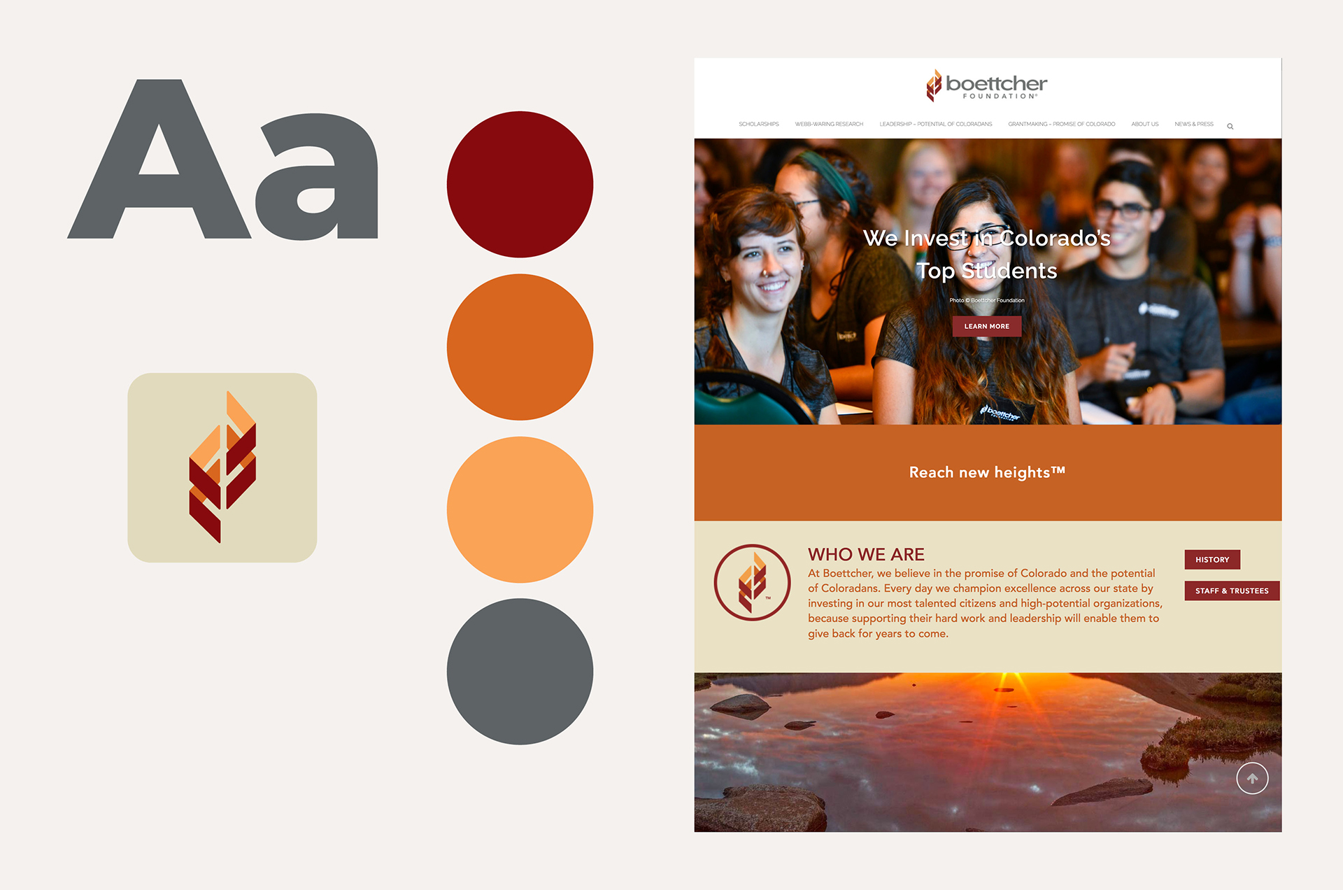
Boettcher Foundation logo shows how pieces can come together to collectively create something greater, portraying the idea of collaboration. It conveys a strong upward trajectory, evoking the idea of stairs, climbing to, reaching, and achieving new heights. You can see a B hidden in the mark, mountains on their side, and even a nod to a double helix.

Boettcher Foundation colors are inspired by the landscape of Colorado. The warmth of the red and orange evokes a feeling of being bold, reliable, and energetic, while the coolness of the gray helps to balance the overall palette.