Tell a Story with Numbers: The Power of Infographics
Posted by Rod Lemaire on July 16th, 2013
Posted in Blog, Nonprofit Communications, Nonprofit Web, Storytelling
At Mission Minded, we love words—we really do. Concise and powerful language is an absolute must for your organization’s brand. We encourage our clients to use data and statistical language sparingly, if at all. Facts and figures can be hard to appreciate, and we can’t assume that potential donors have the time or attention span to research the context of the data.
Yet, we know it’s hard to leave those important numbers out of your communications. To you and your colleagues, those facts and figures make perfect sense—and what better way to inspire support than to demonstrate your measurable impact, right?
Well, there is a better way to inspire support: tell a story. The more visual, the better. This story can be an emotionally resonant success story revolving around one particular individual or group of people.
You may find that you still need to use some data to really drive your point home. We’re here to tell you that our recommended methodology for attracting support still applies: tell a visual story—about the data.
The perfect vehicle for this statistical storytelling is the infographic. That is, a visual representation of qualitative or quantitative information wrapped up in a neat, graphically-designed package. For example, our client CollegeSpring has some infographics on their website. GOOD magazine also integrates surprising statistics and figures into compelling infographics. CharitySub, a startup that facilitates charitable giving, elucidates important issues with sophisticated infographics like the one below.
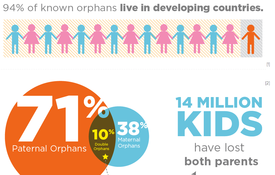
Done well, infographics can add a critical layer of emotion to the cold, hard data. Infographics are designed to resonate with our sense of logic and our sense of compassion. The strongest communications tools are rational and emotional in their appeal, and when we have limited attention from potential supporters, the infographic is the perfect vehicle to get that rational/emotional message across.
When infographics play a supporting role to the general content and imagery of your communications materials, you can avoid the dangerous traps of verbosity and statistics overload. (Our Minute Message Model helps nonprofits overcome this pitfall, too.) Strong infographics also free up precious page space—online or in print—for your most powerful written messages and photos.
Recently, Mission Minded worked with LiveWell Colorado, a nonprofit working to reduce obesity in the state by promoting healthy lifestyle choices. Together, we created a standout fundraising case for support, titled “Game Plan: Movement.” The case for support paints a dazzling and inspiring picture of the organization’s vision and work. It encourages the prospective donor to absorb the information with eye-catching headlines, strong content, active photography, and of course, infographics.
Take a look at this spread. The donor is drawn to the bold header, the image of goofy orange-slice-smiles, and the strong writing. She wants to skim, but before she turns the page, she’s halted by a powerful infographic. Within seconds, she’s absorbed some alarming information about Colorado’s obesity challenge—and the critical message that LiveWell is actively addressing it.
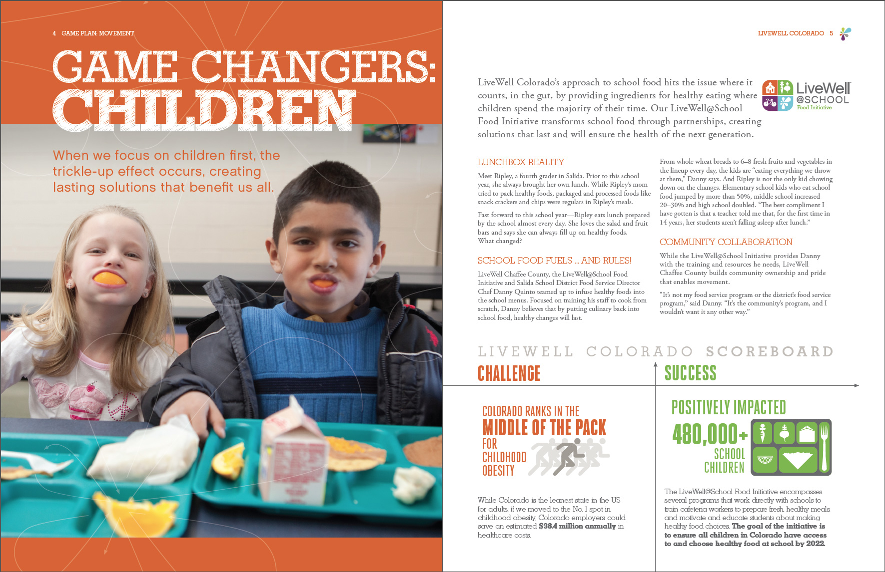
Now she’s hooked. Her desire for data, numbers, and logic has been met, and her heart has been touched by the message of a children’s health crisis.
She wants to keep reading. She wants to know what other challenges exist, what the organization is doing to meet these challenges—and most of all, she wants to know how she can help them.
Don’t you?
Rod Lemaire is a Mission Minded Partner and Creative Director, overseeing our award-winning design studio. Rod delivers more than a decade of art direction and communication design expertise for mission-driven organizations.
See all posts by Rod Lemaire